Painting is a very reflective and personal process for me which partially explains my choice of working with watercolour as a primary painting medium.
It creates no barrier between me and an artwork. I pour all my being and every bit of my energy into my work, painting and drawing only what I feel and have experienced.
I’ve been always fascinated by time, full of fear of its passing, and keep capturing those fleeting moments of life, I may paint and draw various subjects but it’s the vulnerable, the transient in them that I am always attracted to.
Starting this year 2024, I am going to write a blog every month on the Art works that I have created during each month. Highlighting the artworks that I have done during this period. A small writeup about the works completed during this month.
This month started with accepting challenge from Stradeasel. But couldnot keep up the pace and quit the challenge after 5 days.
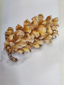
An Acorn Flower. This was picked up from my Himalayan Trek, one of my most memorable Travel.
I have used different shades of Yellow- Lemon Yellow, Chrome Yellow and Yellow Ochre. Then Browns- Burnt Sienne and Burnt Umber with Prussian Blue for the dark shades. Doing each petal is the challenge, getting the light and dark effect to make it look realistic. Enjoyed the process of doing this work.
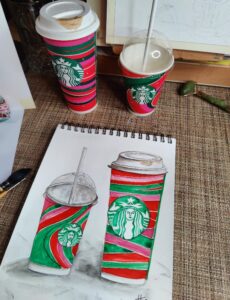
Starbucks Coffee Cups. Another interesting topic. I liked the colours and wanted to try it. So instead of throwing the Coffee cups, kept it aside for painting. It was much easier to draw and finish the painting than I thought.
I used the colours as seen in the cup… Sap Green, Red, Crimson and shades of Prussian Blue with a touch of Black.
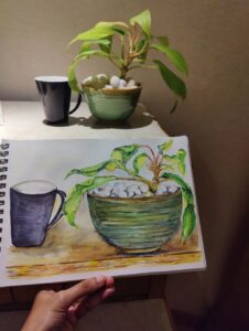
An arrangement created to capture the beautiful colour of the Bowl and the Plant, to that added a contrasting colour Mug. Interesting to capture the Yellow green colour of the Ceramic bowl and the white Pebbles. The Plant’s light yellow and green shade.
I used Lemon Yellow as base for the plant and the bowl, then highlighted the shaded areas with darker greens, blues and browns. Liked the outcome especially the Greens of the Plant and the Pebbles.
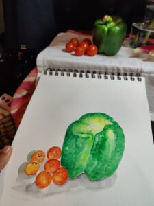
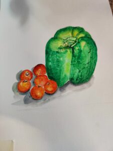
It was an arrangement just created to be in the stradeasel challenge. I was not particularly happy about the work, but it was a good try. Could comprehend the different colours of the tomatoes and the capscicum.
I used Lemon Yellow as base for both, then highlighted with Orange and Red for the tomatoes and for Capscisum, used shades of Green- Sap Green and Viridian green for the highlights. Shadow colours are Prussian blue and Burnt Umber.
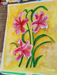
It’s a very old painting in watercolour. Oriental Lillies. It was an incomplete work that I had left to do the finishing … took it up to complete it to show it to the students at the school I teach where they Topic for their Portfolio work was flowers.
I have used Crimson Red for the flowers along with little bit of Red and Brown to give the light and dark shades. The strokes are very in vivid colours and look lively. Beautiful Pink Oriental Lillies.
